Every once in a while, we’re going to tell you about the changes in hihaho. Today, we’ve got some big updates that might be useful to you!
A new menu
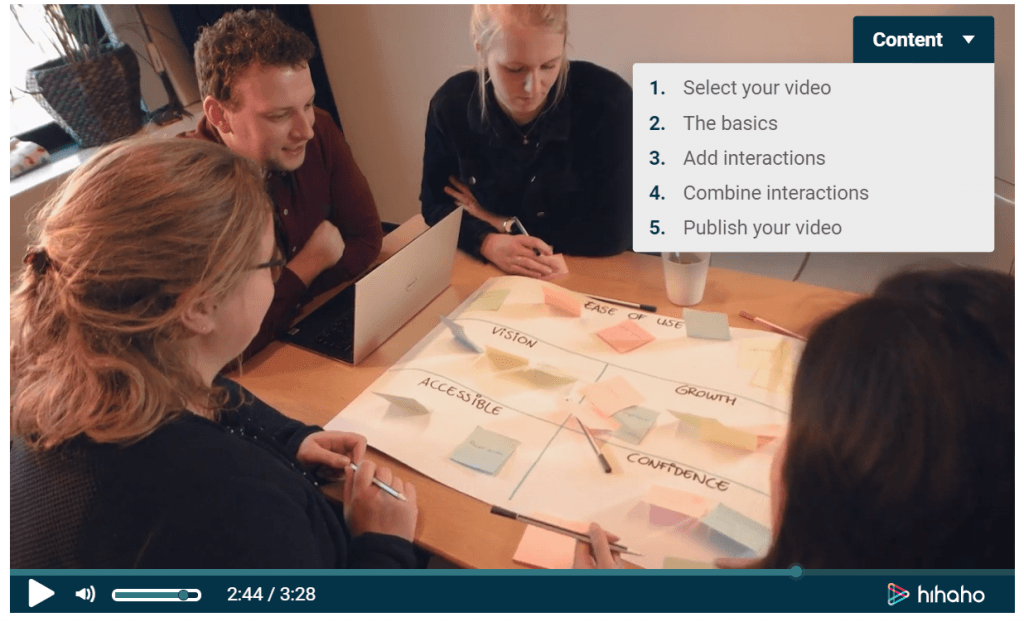
The Menu interaction already existed a long time. It’s a menu that pops op when the viewer clicks on the menu button, and / or at a time the author sets. But now, we’ve got a second menu option called ‘Table of contents’. This menu doesn’t pop up, but it’s visible on the side of the screen. This way, the viewer can always go to another chapter. They can open and close this menu whenever they want. So like the name says: it’s like a table of contents!
Many people think the table of contents is more beautiful than the pop up menu. What do you think? Click on the menu interaction and see for yourself. If you’d like more information, click here to go to our support page.

Let your audience rate your video
Have you always wondered what people think of your video? Or would you like them to rate an idea, a product or something else? From now on, people can show their opinion by giving one, two, three, four or five stars. You can find this new feature when you go to the Question interaction.
A smoother transition for your text
The Text interaction used to pop up suddenly, but this can be a thing of the past. If you’d like to have a smoother transition, you can enable the button ‘fade in’. You can find this feature when you go to the text interaction and click on ‘Style’.
So these were the biggest updates from the last months. Of course, our team is working around the clock to improve the tool and to ensure you have the best user experience. The text editor has changed and works better now. Also, we’re adding new video platforms. Furthermore, we’re working on something that we will announce in the next update. I promise you it will be something big!
Do you have ideas for hihaho? Please let us know! We would love to hear your suggestions.


