“My video has been watched 3200 times, but only 50 people clicked on my first interaction. What can I do?” one of our users asked. You may be wondering the same. So here is some advice to get more clicks on your interactions!
1. Timing
The purpose of interactive video is to engage your viewers, to pique their interest and to encourage them to watch the video until the end. If it takes a long time before your first interaction appears, it means that you missed the opportunity to engage your viewer right from the start. So we recommend adding an interaction in the first 20 seconds of the video. Furthermore, if there is a lot of time between two interactions, that would also mean a long time without really engaging your audience.
Of course, the interest of your viewers does not only depend on interactivity. Good storylines, talented actors, a variety of shots, and other filming techniques have a big influence on the impact of your video as well. So when you decide where to put interactions, you can always take this into account. The question you have to ask yourself is: do I think my viewers could lose their interest in this part of the video? If the answer is yes, add an interaction.
2. Let your viewers decide what to watch
If your viewers have to watch a scene they’re not interested in, you’ll risk losing them. This is why we’ve added a button to our homepage video called ‘Skip intro’. 10% of our viewers click on this button and go to the part they want to see right away.
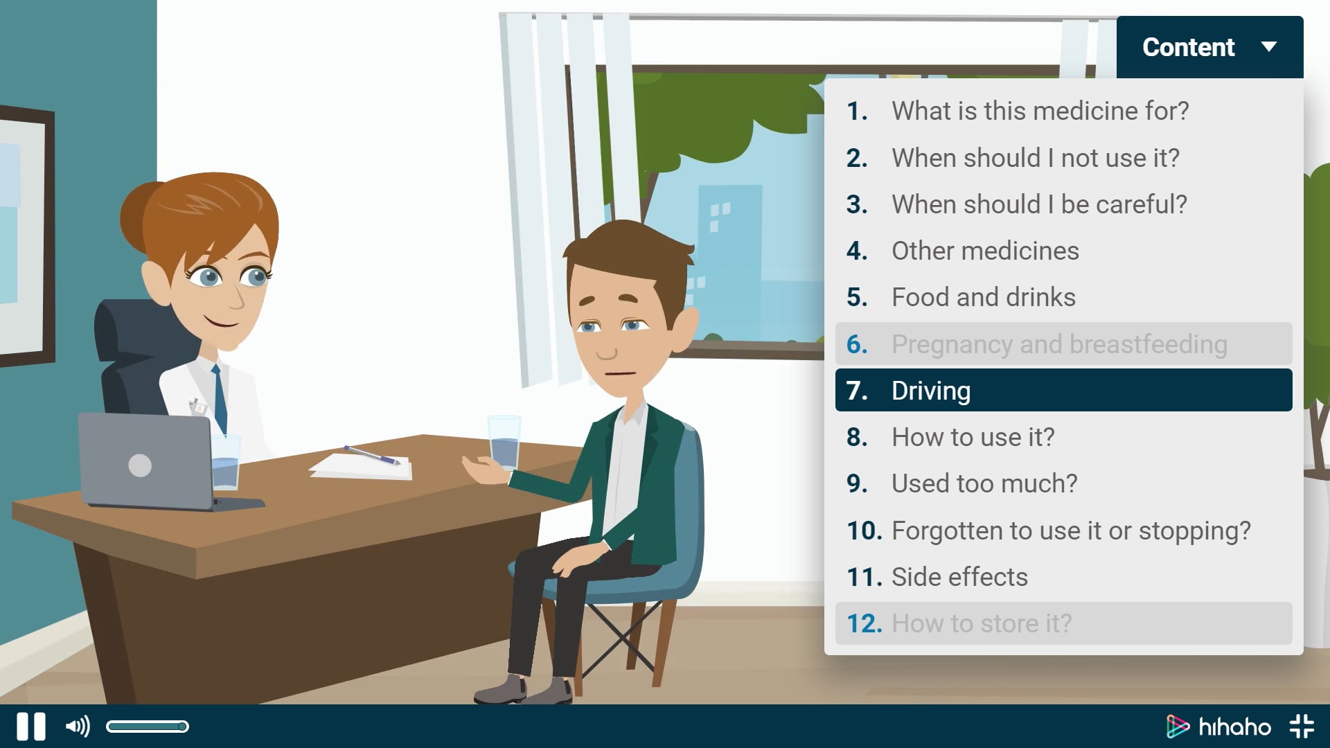
Of course, a menu also enables your viewers to jump directly to the scene they want to watch.

3. Make sure your buttons are recognizable
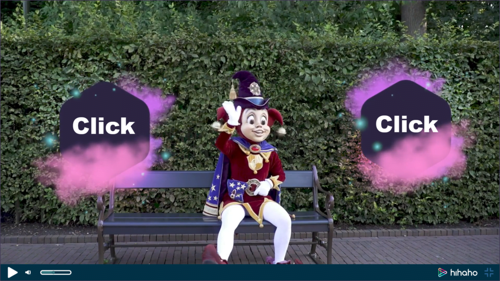
Do your viewers know they can click on your buttons? It’s possible that they don’t recognize your button as a button, since interactive video is relatively new. To help your viewers, you can add a pointer or a text like ‘Click to go to our website’. If there are people starring in your video, you can also let them point out the option to click on the button. Lastly, the design also helps. For instance, a regular text without any background color or border will look more like an informing keyword instead of a clickable button.
4. Place of the buttons
Make sure your buttons don’t disappear behind the player bar. When you click on the second button below your video, you can enable the grid feature. The green layer indicates where the player bar will appear when the viewer moves the mouse cursor. It’s best to place interactions above this green line.
Furthermore, a big button in the center of the screen attracts more attention than a button in the corner. So if you really want people to click on a certain button, place it in the middle.
5. Design of the buttons
Make a button that stands out and doesn’t disappear due to background colors. Choose a design that invites your viewers to click on it. And don’t write too much text, make it short and sweet, and easy to read.
6. Avoid too much text
The tip “Don’t write too much text” doesn’t only apply to buttons. Viewers expect a visual experience. If you create a Pause Screen and use it to fill the screen with written information, the viewer might click your video away. When you want to provide a lot of information, it’s better to add a button saying: “Download our house rules”.
The same advice applies for creating questions. When you create a question, you have the opportunity to write feedback using a feedback screen. It’s best to keep your feedback short. And if you are someone who creates the videos from scratch, it’s even better to write the feedback in the script. This way, you can disable the feedback screen and let the actor in the video explain why an answer is right or wrong.
7. Hotspots
Hotspots can make a film shot more interesting. For instance, if you have a shot of a machine, it’s more fascinating if the viewer can hover their mouse cursor over the hotspots and explore the components.
Advice for your most important button
If you really want people to click on a certain button, it’s best place is at the beginning of the video. Not everyone will watch the entire video, so the earlier it comes, the more people see it. Place it in the center to make it stand out.
Getting useful information
And here is another benefit of knowing how much your interactions have been clicked on. For instance, I created a Travel video containing 7 hotspots. And I discovered that most people clicked on ‘Balloon festival’, followed by ‘Thailand’. Cambodia seems to be the least popular holiday destination. So if I were a Travel agency, I could use this information to decide what my next marketing campaign would focus on.
Of course, this information is only representative if all the buttons equally stand out. If a button appears earlier, is bigger, or looks more appealing than the other buttons, this would also be a reason for more clicks. For instance, in our homepage video, most people click on the demo video in the top left, since people from Western countries generally read from left to right. It’s important to keep factors like this in mind when you look at the statistics.
Good luck with increasing your amount of clicks!


